Recently I received some interesting data from the Met Office – locations of every lightning strike to hit the UK and Ireland in 2017. The email immediately got my attention – I never knew it was possible to record this kind of data, let alone that it’s available for analysis and visualisation. If you want to learn more about lightning and how it’s recorded, the Met Office has produced this handy overview page.
So let’s get back to the data. Before creating the visualisation, I wanted to understand what I was working with. Naturally, my journey started in Excel.

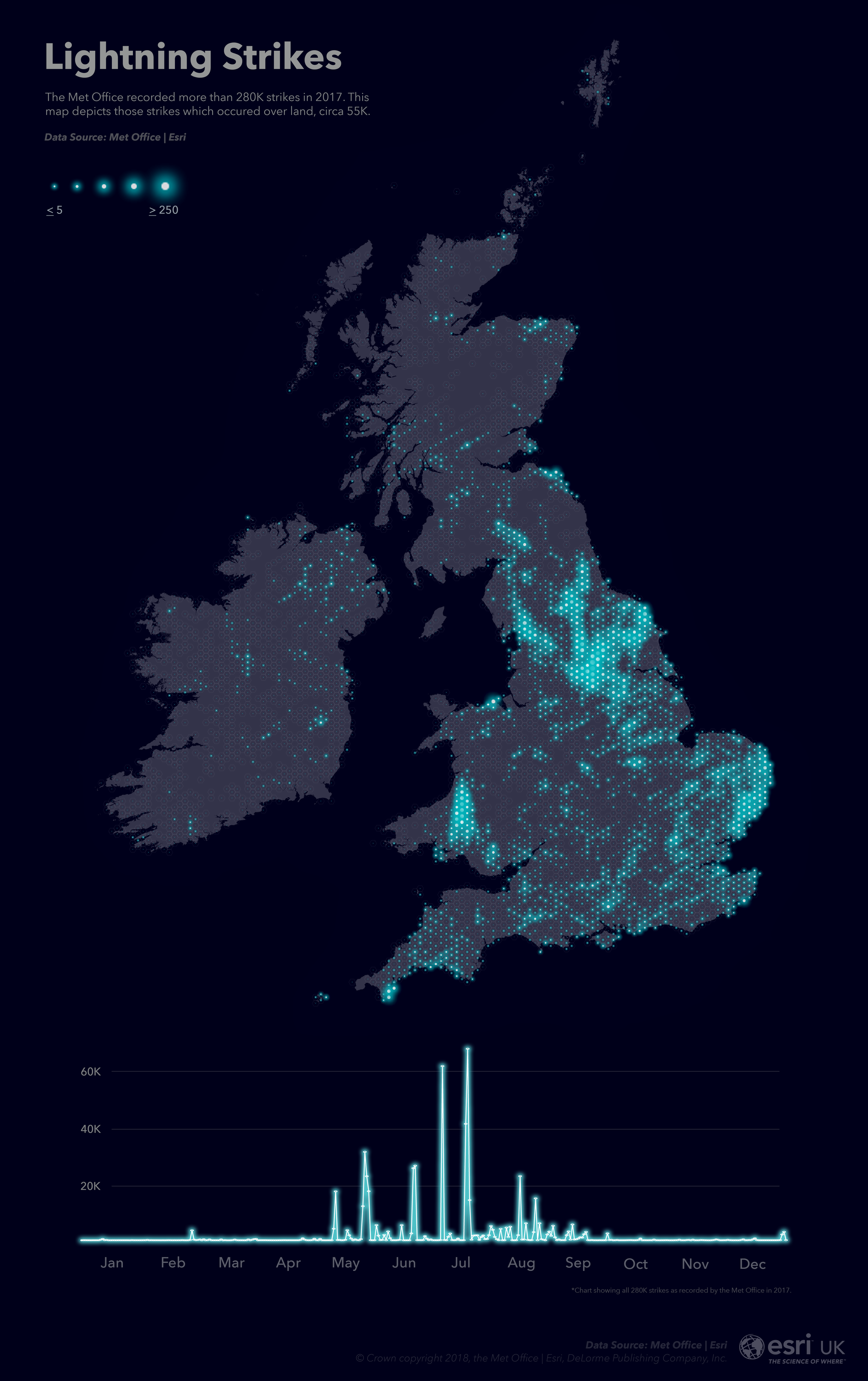
Loading up the data, I quickly realised that there were a LOT of lightning strikes in 2017 – two hundred and eighty thousand in fact.
To gain more insight, I decided to chart the information over time.
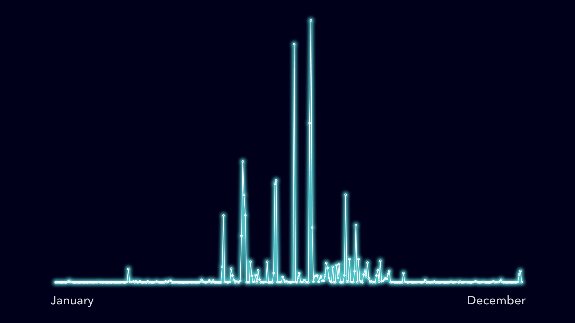
It became clear that most strikes were concentrated over summer months, with spikes in activity occurring over a few given days. Pretty interesting, but this data was crying out to be mapped.
I jumped over to ArcGIS Pro and created a simple map of the UK using the Living Atlas World Countries layer. This provided a base for the data I was about to map.
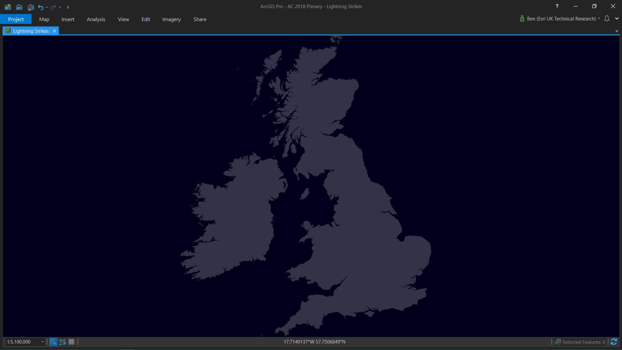
I then added the Met Office lightning data to Pro using the add ‘XY Event Data’ option, latching on to the long/lat in the spreadsheet.
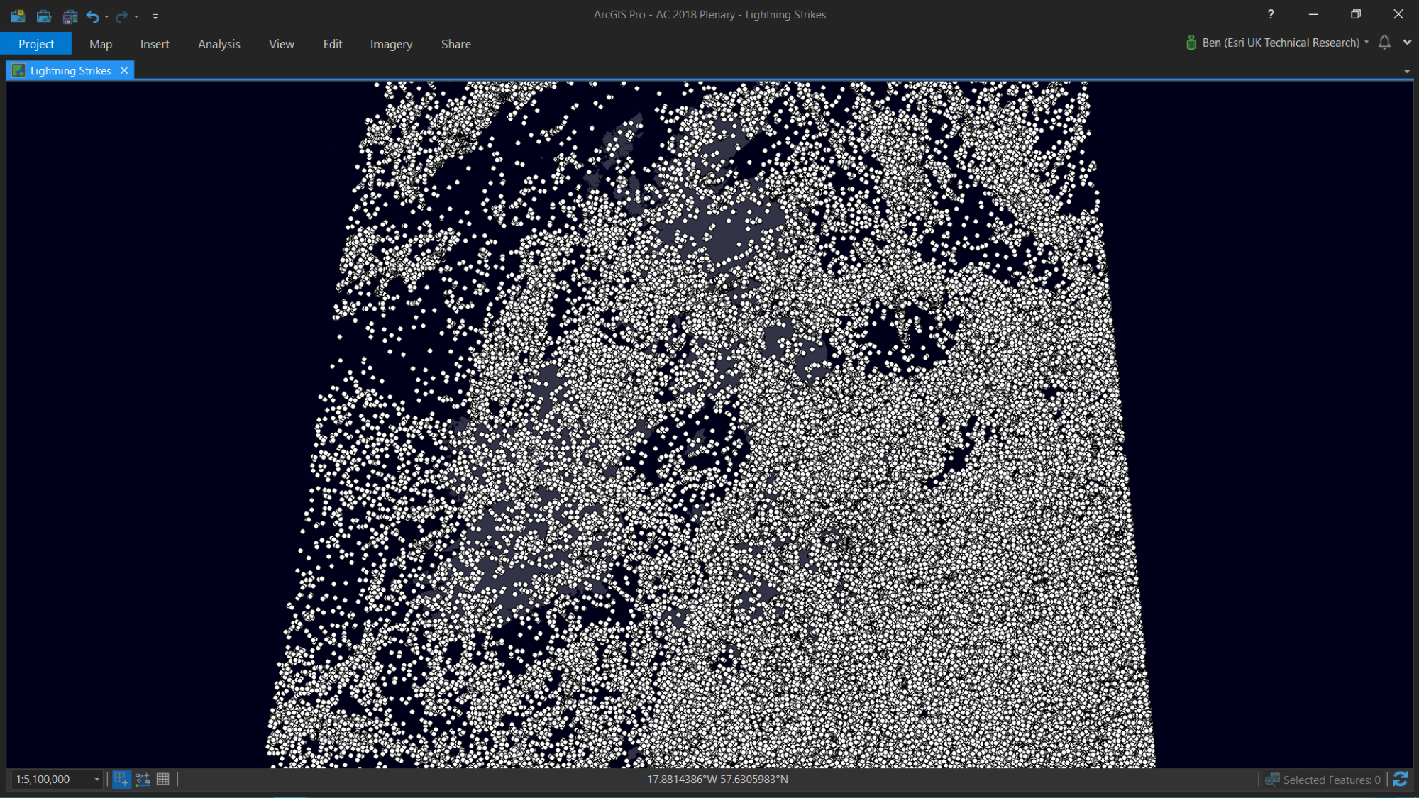
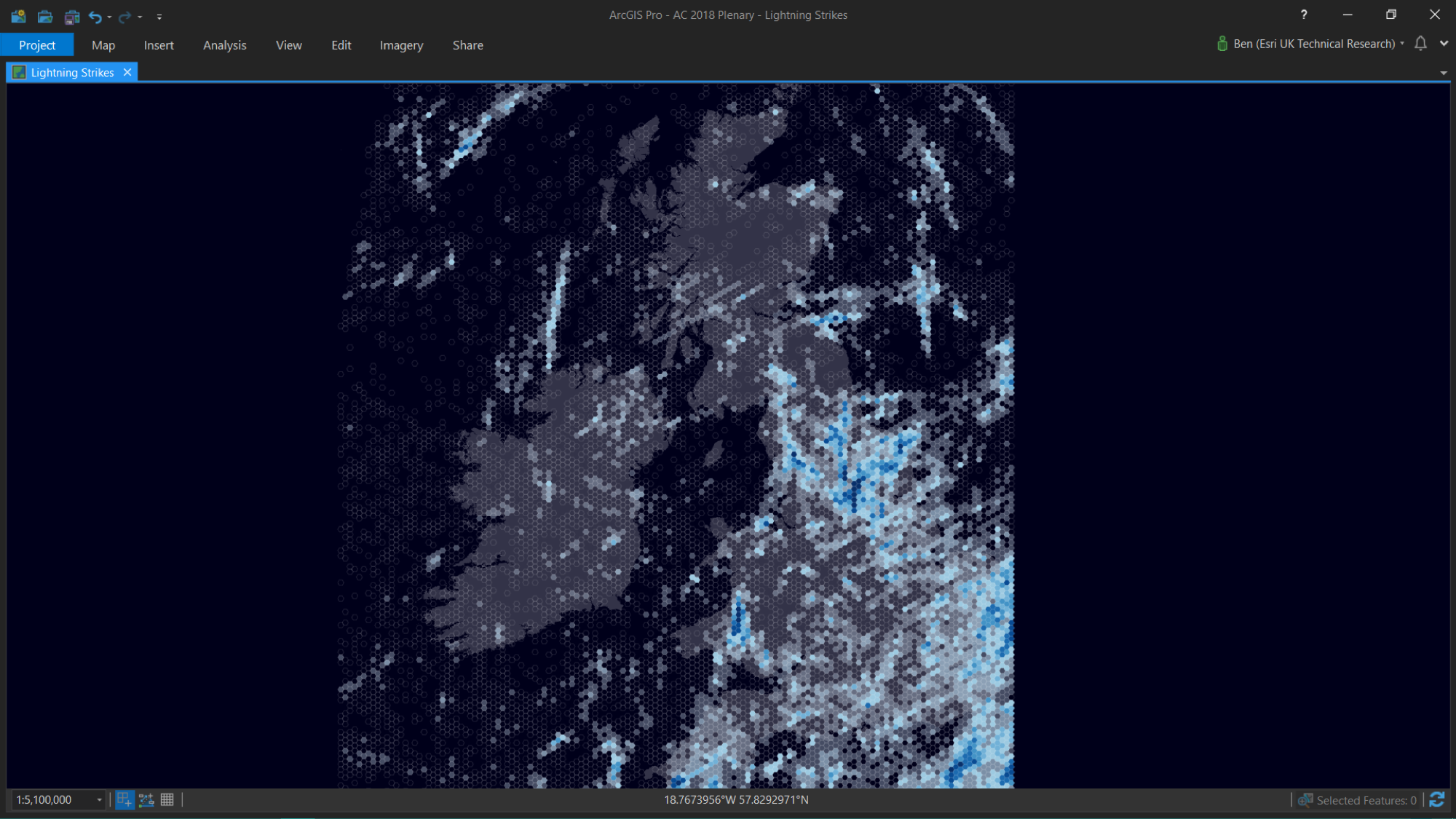
My map became a mess! The sheer volume of data made it impossible to observe any spatial patterns. To make more sense, I needed to aggregate my data – but to what?
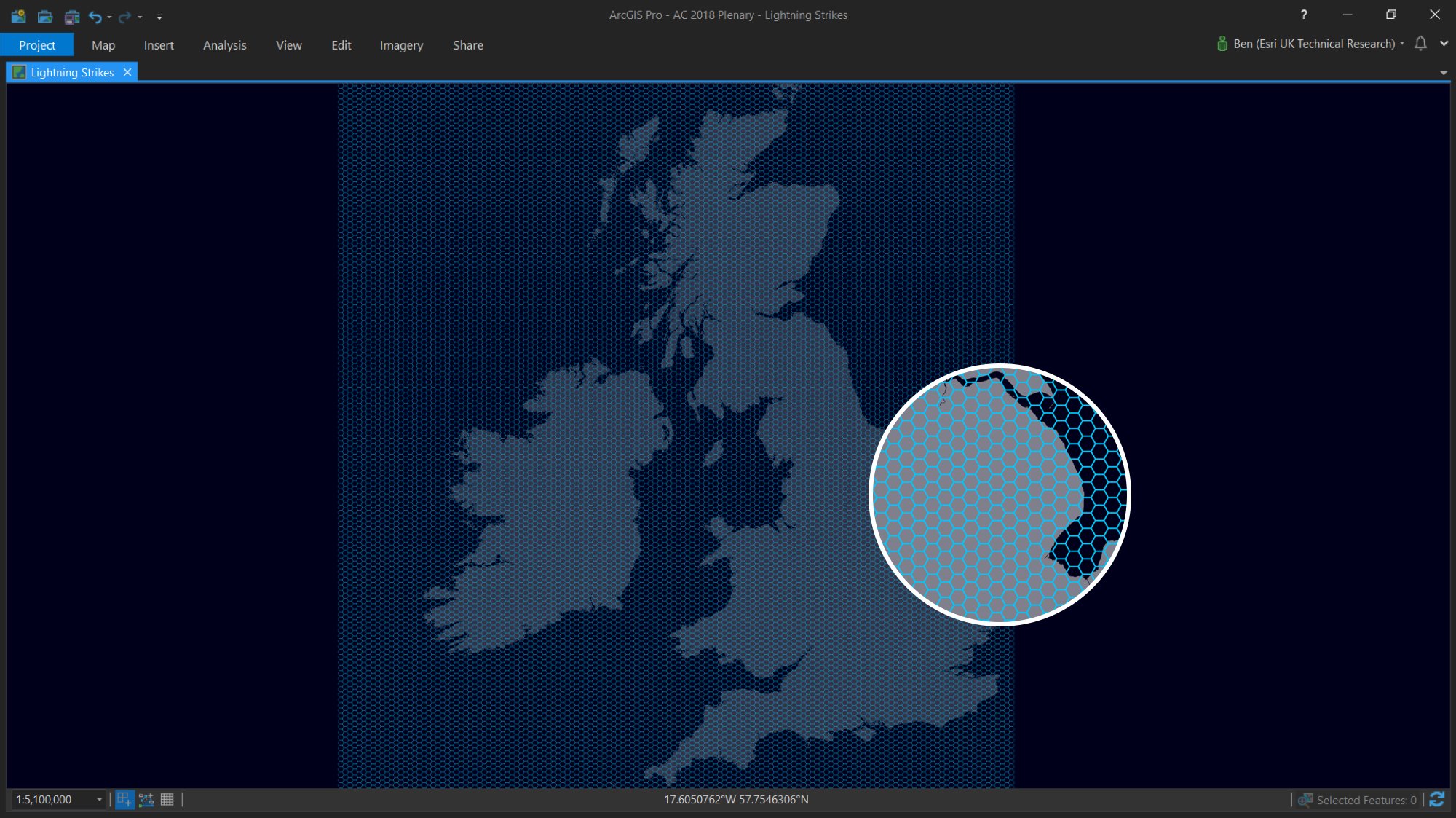
Local Authority areas? Counties? Regions? These would all work, however probably not the most appropriate for this kind of data. I needed something that would have an equal weighting across the UK and Ireland.
Thankfully Pro provides a handy tool called Generate Tessellation. This feature allows us to create a tessellated net of squares, triangles or hexagons. I opted for the hex as, to me, they are the most visually interesting. I ran the tool to create a net of 5km hex bins to cover the UK and Ireland.
The next step was to fill these newly created bins with data. To do this I used Pro’s Identity tool to assign each lightning strike with its corresponding hex bin ID (this requires an Advanced license but you could use a spatial join instead). Then, using the Summary Statistics tool, I was able to count how many strikes occurred in each bin, based on the common hex bin ID. Finally, I joined this newly created table back with the original hex mesh.
BOOM! I had data pouring into my bins! I applied a graduated colour renderer to the data using Pro’s advanced symbology capabilities:
The map was looking good, however I was only really interested in strikes which occurred over land. To improve this, I used the Clip tool and quickly clipped the hex mesh to the land extent of the UK and Ireland.
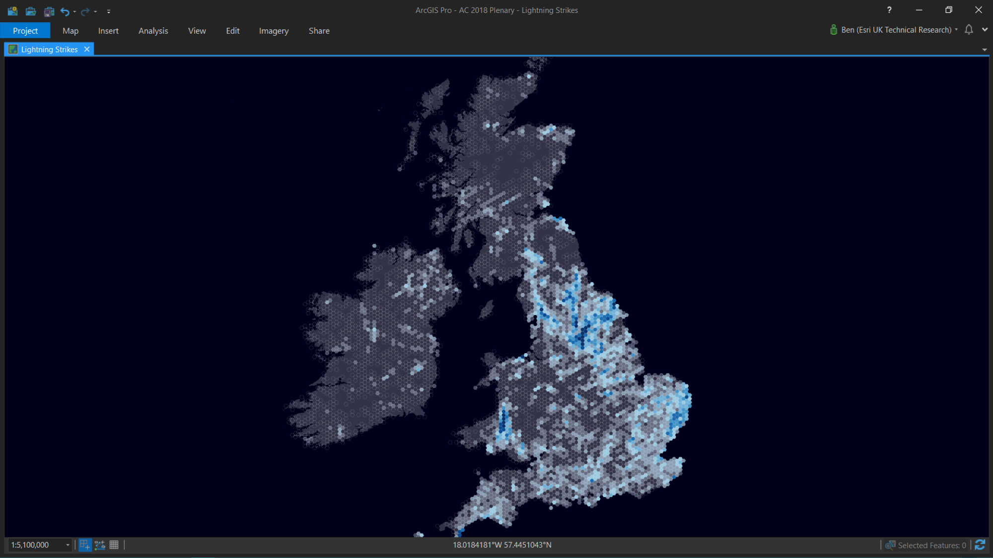
Much better. It’s possible to observe spatial patterns in the data – most strikes were concentrated towards the northern and eastern parts of England – as well as a hot spot of activity in Wales.
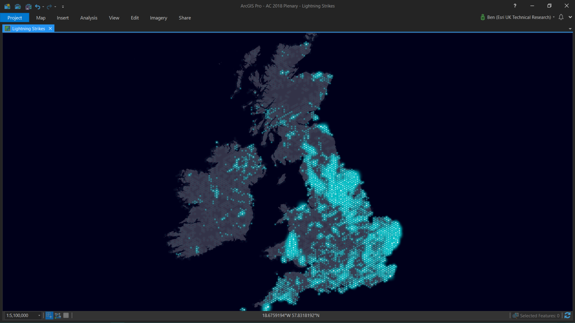
One final touch – using proportional FireFly symbols, I tried to create a sense of realism with these glowing electric blue dots:
And here’s the finished map! Adding a title, legend and short description helps to provide a little more information to the end reader. I also decided to incorporate the chart of strikes over time at the bottom of my map:
But there’s more! After talking to the team about this cool data, one of our dev’s mentioned it could work well with the new WebGL renderer in the ArcGIS Maps SDK for JavaScript. After 30 minutes of hacking around, Sean McGee (developer evangelist at Esri UK) sent me this – pretty cool right?!

This animation is a GIF screen capture of a browser window. We visualised 4 days of lightning activity, rendering over 60K points in the browser at lightning speed (sorry, I couldn’t resist).
Want to create this kind of animation with your own data? Check out Sean’s blog post – it’s super simple!
If you’ve enjoyed my walkthrough and would like to reach out, you can connect with me on twitter @benflan or drop me an email bflanagan@esriuk.com.
Thanks!
![]()