Following last week’s post on the recent introduction of Insights to ArcGIS Online, I figured it would be an opportune time to let you know about the improved accessibility of The Living Atlas, that now sits within Insights. I this blog I’m going to use Insights to explore some data from the Living Atlas.
Adding Living Atlas Data
In the previous version of Insights, there was an option to access some content from The Living Atlas, but for the UK this was somewhat limited. Now that Insights is within ArcGIS Online, we have full access to the Living Atlas and all it’s marvellous contributions. It can be found by selecting Add Data and navigating to The Living Atlas tab, within Insights.
The two datasets I have used for this walkthrough are UK Qualifications and Index of Multiple Deprivation 2015. Both are contributed by the Esri account and include data from Ordnance Survey, ONS and DSLG.
Exploring The Data
For me, the best thing about Insights is the ability to create a wide variety of visuals, not limited to just maps. But a map is always a good place to start exploring the data, so I dragged both datasets into their own cards.
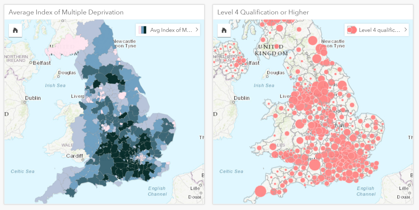
The left card shows the multiple deprivation score and the right card the level 4 qualification or higher values.
I then ran a spatial aggregation tool – which allowed me to combine attributes from both datasets, based on their location. Usefully, the data created from this tool is now stored as a new card, making it possible to conduct further analysis on the underlying data. I selected the two attributes from the new card and dragged them onto my main work space – which gave me an option to create a scatter plot.
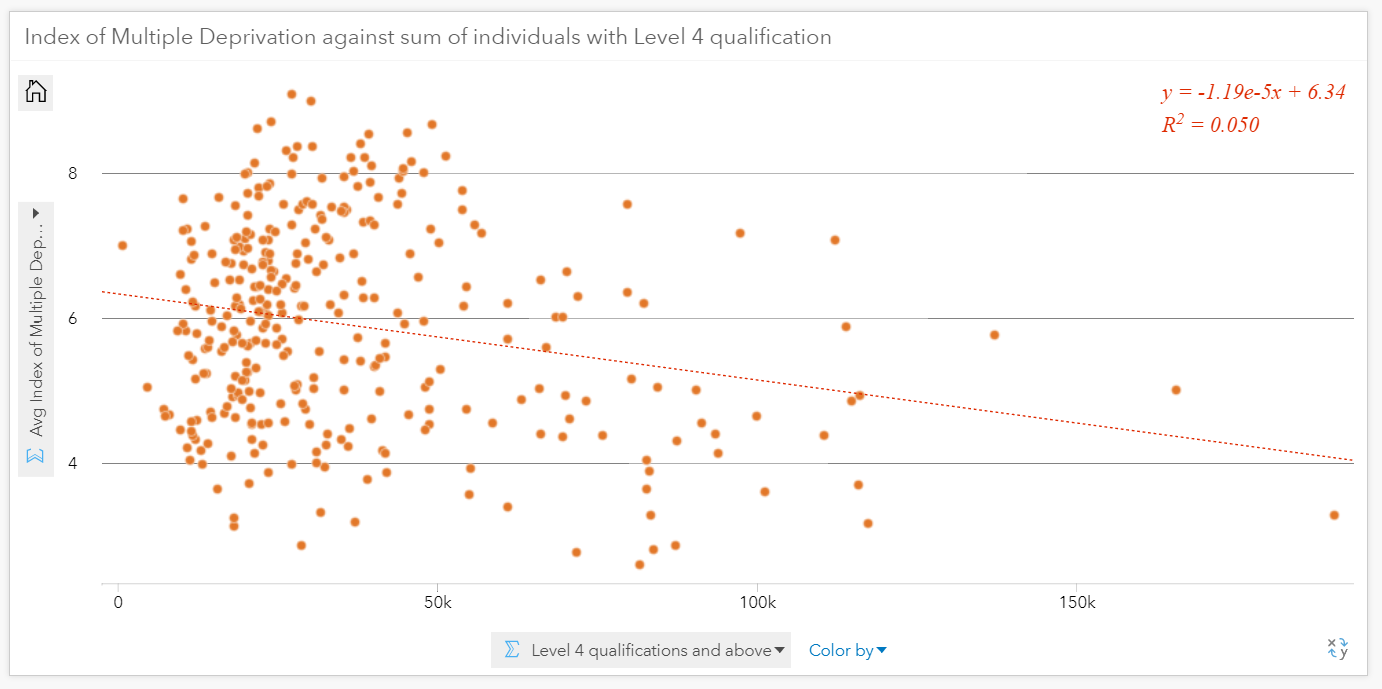
y axis = Average Index of multiple deprivation score, X axis = Level 4 qualifications and above
The scatter plot visual has a linear line tool that helps to identify correlation. It also provides a statistical summary in the top right corner, so you can realise there is, in fact, no significant correlation between deprived areas and individuals with a level 4 qualification! I wanted to take this visual one step further, dragging and dropping further attributes onto the chart – which are reflected in the size and colour:
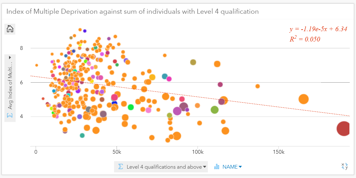
The size of each circle represents the percentage of population in full employment, for each area
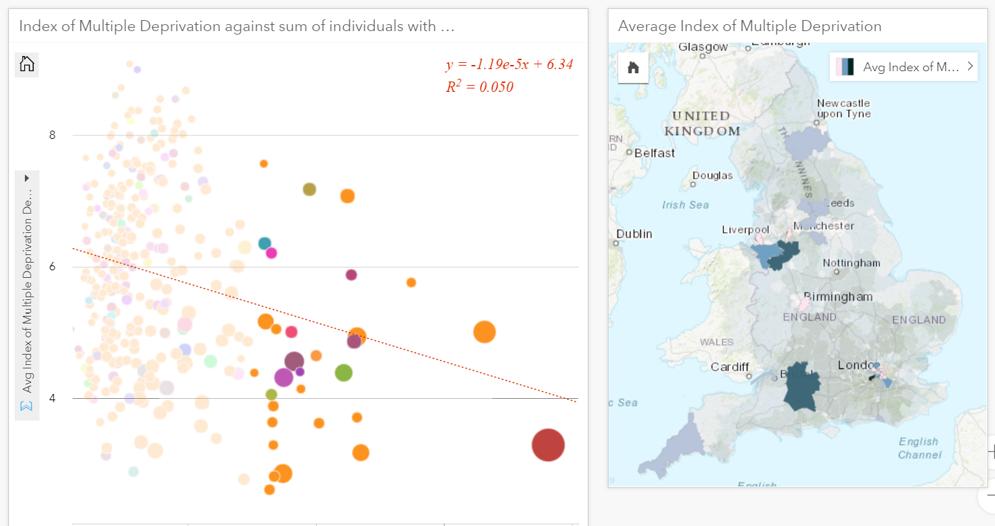
Finally, a powerful aspect of Insights visual analysis is the dynamic selection. This allows you to select data from your chart and in response the relevant areas are highlighted on your map card. A fantastic feature if you want to locate the anomalies in few clicks!
Insights is a very easy to use tool but requires appropriate data to fulfill it’s potential. Insights in ArcGIS Online introduces the full Living Atlas and makes it’s application so much easier. Enjoy!
![]()