A few months ago I was given the opportunity to visit a client to discuss cartography and how they can communicate spatial information in an efficient and effective manner.
Whilst preparing for the visit, I started to investigate Colour Vision Deficiency (CVD) and came across some interesting facts, tools and techniques which I’d not really considered enough before.
Whilst there are a number of different types of Colour Vision Deficiency, the most common is ‘red-green blindness’ which affects approximately 8% of males (Jenny and Kelso, 2007). Of this impairment, the most prevalent type is Deuteranopia. Whilst this might not seem a large percentage, this group of users should not be disregarded when designing maps.
One of the most useful tools I discovered is Color Oracle which can be found here: http://colororacle.org/. This is a free little utility which simulates CVD on screen and it’s quickly become an invaluable tool when I design and create maps.
One thing I hadn’t realised is how hard it is to distinguish the subtleties of the commonly used red to green colour ramp for people with colour vision impairments. This colour scheme gets used a lot, especially in hotspot mapping. I personally used this colour scheme since I felt it represented something effectively on a scale of low to high, or ‘good’ to ‘bad’. Since we’re all used to the traffic light system it’s such a common way to represent a range of data. But how is this seen by someone with CVD?
Figure 1 shows how someone with “normal” vision would view a map of wind speeds around the UK. The red areas represent higher wind speeds and the green areas represent lower speeds. But now, consider how this same data might viewed if you suffer from Deuteranopia (the screenshot is simulated using the Color Oracle utility). This clearly shows how hard it is to determine which areas of the UK have high and low wind speeds.
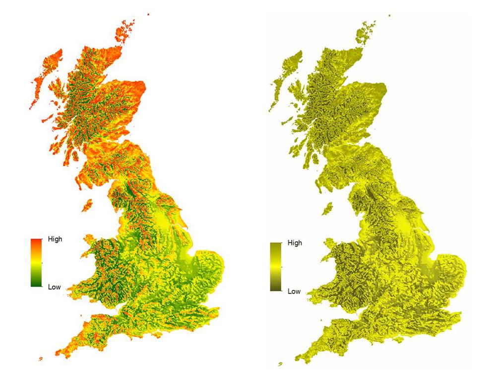
Figure 1. The left map illustrates normal colour vision and the right simulated Deuteranopia (Red-green blindness). Both maps use a red to green colour scheme. Data shows mean UK wind speed from DECC.
So what are the alternatives to displaying such data? Well, there are a number of different strategies and as always it depends on the data and the message that you’re trying to communicate. However one simple option is to change the colour scheme to a red to blue diverging ramp (in ArcGIS Desktop this is called ‘Cold to Hot Diverging’). The advantage of using this is that red can still represent high wind speeds in this example whereas lower speeds are now represented as blue instead of green. Figure 2 shows how this data would appear with normal vision shown against how this compares with some who has Deuternanopia. Both maps are now legible and the high and low wind speeds are distinguishable.
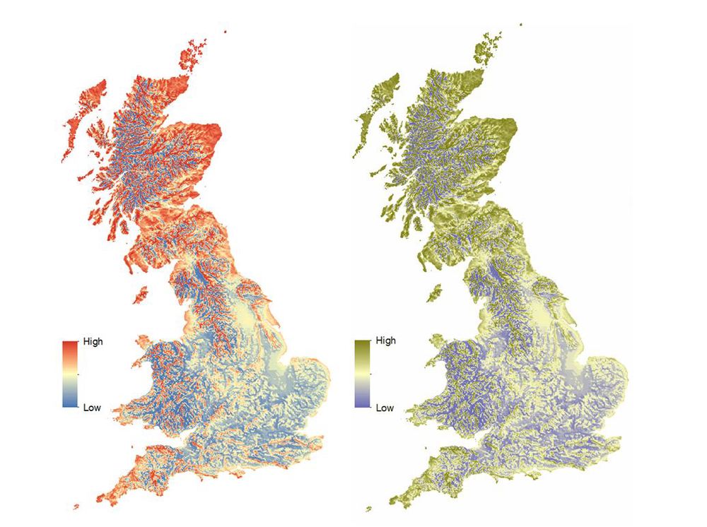
Figure 2. The left map illustrates normal colour vision and the right simulated Deuteranopia (Red-green blindness). Both maps use a red to blue colour scheme. Data shows mean UK wind speed from DECC.
There are a couple of other excellent resources which I would highly recommend looking at. Firstly, for a more thorough discussion of designing maps considering CVD then “Designing maps for the colour-vision impaired” by Bernhard Jenny and Nathaniel Vaughn Kelso is a fascinating read. It’s full of theory and practical advice. A .pdf of the paper can be found here.
Also, for designing colour schemes for choropleth maps, ColorBrewer is an excellent resource. It allows you to select qualitative, quantitative and sequential colour schemes and also has an option for suggesting schemes which are CVD safe. ColorBrewer can be found here and again, I find it extremely useful.
Finally, there is a more general blog article from the Esri Mapping Centre which highlights some excellent colour tools for map makers which can be found here. Also, there is a set of styles designed for maps for the colour deficient in the ArcGIS Resources section.
It is clearly important to carefully consider the colour schemes that you’re using when creating maps. This will help ensure that the information that you’re presenting is meaningful to the widest possible audience. As mentioned earlier, I now use these tools and techniques whenever I’m creating maps and I frequently check symbology using the Color Oracle tool. It’s become an invaluable part of my workflow.
Reference:
Jenny, B. and Kelso, N.V. (2007). Designing maps for the colour-vision impaired. Bulletin of the Society of Cartographers SoC, 41, p. 9-12.