As America prepares to elect its 45th president, many media agencies are opting to use cartograms instead of traditional maps. Let’s explore why, starting with one of the most recognisable images of any US election – a standard geographic map.
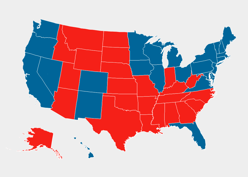
Geographic Map – 2012 Presidential election results
This map works well if you are trying to find out which way each state voted (red is Republican, blue is Democrat). However, if you want to know who won the overall election, good luck. Obama led the Democrats to a landslide victory in 2012. A map that prioritises geography distorts this and, if anything, makes the 2012 Republican vote look stronger.
To understand why you need to know a bit about the US electoral system. US presidents are not chosen by a simple popular vote. Instead citizens vote for electors who are pledged to one of the candidates. This is known as the Electoral College.
The College is made up of 538 electors who represent the United States. Each state is allocated a number of electors, based on the size of its population. California has the most with 55 – whereas Wyoming, which has a much smaller population, has only three.
In almost every state, the winner of the popular vote takes all the Electoral College votes. The candidate who gains 270 votes wins the White House.
In 2012 Obama won by a margin of over 100 electoral votes, so why is the map so red. Take New Jersey, for example, it’s barely even visible on the map but accounts for 14 electoral votes. Whereas Montana, the fourth largest state by geographic area, accounts for only three. States are allocated electoral votes based on their total population, not their geographic size.
To solve this problem, we need to prioritise electoral importance over geographic accuracy – hello cartogram!
Cartograms have been around for a while, but have only recently been adopted by the mainstream media (particularity in the US). They maintain neither shape nor topology, however they do try to preserve some sense of geography. There are many differing techniques when creating a cartogram – let’s explore a few.
Gastner-Newman
The Gastner-Newman method attempts to preserve geography while shrinking and stretching boundaries. These maps can look very strange and often be hard to interpret – probably the reason they are not widely used by the media.
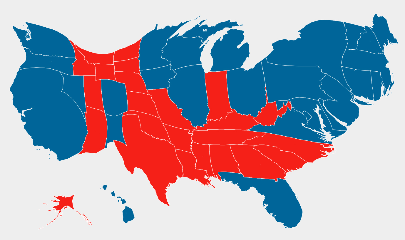
Gastner-Newman Cartogram – 2012 Presidential election results
Dorling
Then there’s the Dorling Cartogram. Invented by Professor Danny Dorling, this technique uses ordered geometric shapes in place of geographic areas. The result is reminiscent of a proportional symbols map, but repositions object centroids to avoid overlap.
This method was widely used in the 2012 election, however it appears to be less popular this time around.
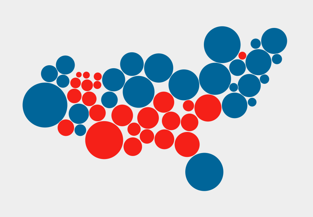
Dorling Cartogram -2012 Presidential election results
Demers
A variant of the Dorling Cartogram, using squares instead of circles, the Demers method is popular with the US media. Again this technique uses proportional shapes, but prioritises contiguity over distance from original centroid.
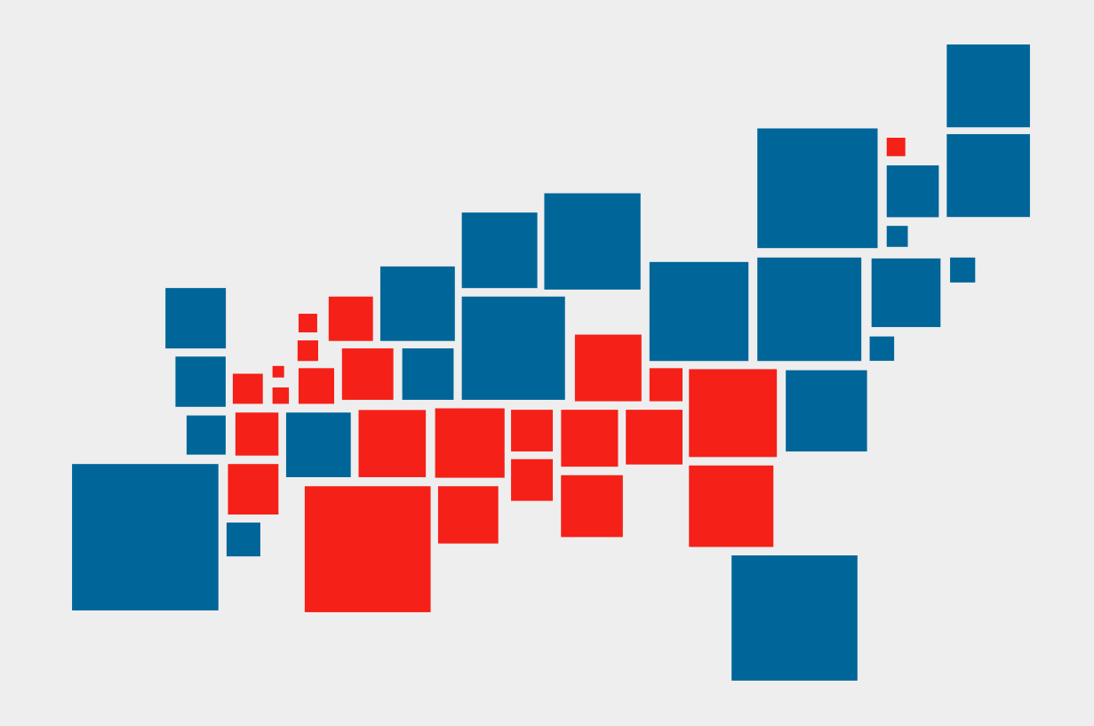
Demers Cartogram – 2012 Presidential election results
The Hexagon
One of the most widely used techniques for presenting election data (especially in recent years) is the hexagon cartogram – or hexogram!
Hexagons are pleasing on the eye and tessellate well, allowing for a better representation of the original geography. As with Dorling and Demers they maintain neither shape nor topology, however hexagon cartograms often create a more recognisable image.
In the example below, each hexagon represents one Electoral College vote. A thicker border is used to group hexagons into their collective states, which helps to visualise the voting power of each area.
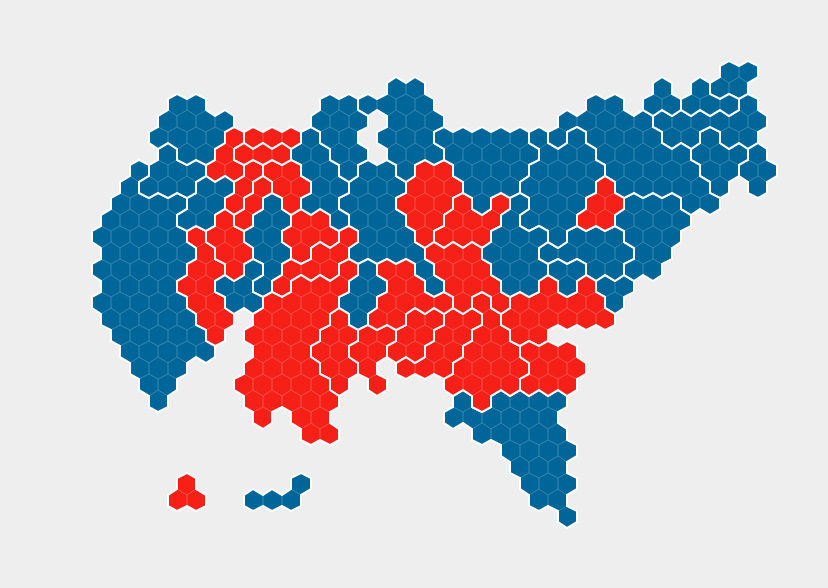
‘Hexogram’ – 2012 Presidential election results
2016 Maps
So now we have looked at the different cartographic techniques, let’s explore how the media are mapping the 2016 presidential election!
First up, The New York Times. They have opted for two maps – a traditional geographic version and a Demers cartogram. Displaying two maps in this way helps readers to understand the voting power of each state, while being able to refer back to the true geography.
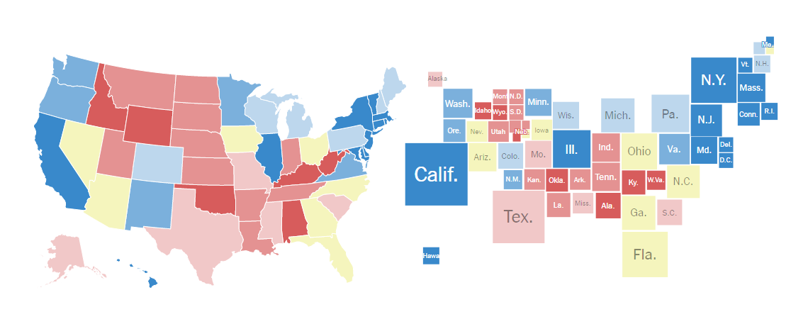
The New York Times- 2016
National Public Radio (NPR) have also opted for the Demers technique. Although, NPR have shifted the geometries to give a more realistic impression of the United States.

National Public Radio – 2016
The Times, London, have used hexagons to map out the election data, while also having a geographic map providing readers with a choice. This is one of my favourite election maps – although I may be a little biased as I developed it for The Times!
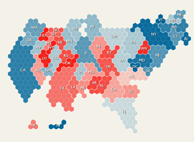
The Times of London – 2016
With what appears to be a new technique this year, the Washington Post have created a diamond cartogram.
It can be a little harder to see state boundaries, however the overall effect is pretty striking. There is also a nice transition between their cartogram and geo map.
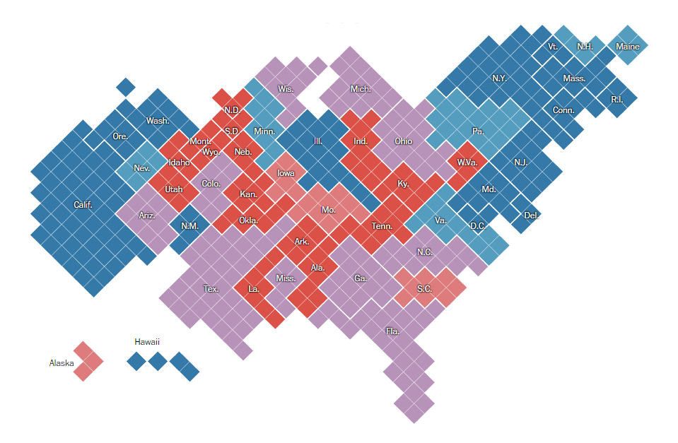
Washington Post- 2016
UK election mapping
Whilst this post is meant to be about US election mapping, it’s worth pointing out that cartograms are also used to map UK elections.
In general elections, each constituency elects one MP to the House of Commons. But the total area of constituencies varies greatly as it is dependent on the size of the population. By using cartograms, we can give each constituency an equal visual weighting.
In the example below, it’s clear that Scotland represents a considerable geographic area yet elects only 59 MPs, compared to 533 in England. The cartogram reduces the size of Scotland proportional to the number of MP’s it can elect. This can make the UK look a little strange but tells a much clearer story.

Cartograms were also used to map this years EU referendum – a selection can be seen below. Each version shows votes cast in UK local authorities.
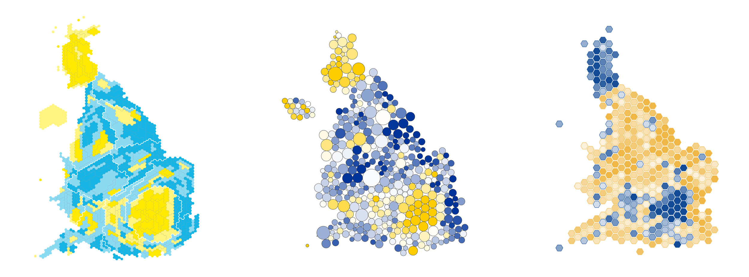
(left to right) The Guardian, Buzzfeed, The Times
Resources
The open-source Gastner-Newman geoprocessing tool can be downloaded from here and used within ArcGIS Desktop.
We have also published the US and GB hexagon cartograms as Esri Shapefiles which can be downloaded and used as templates for joining other datasets:
GB Parliamentary Constituency Hexagon Cartogram (Esri Shapefile)
GB Local Authority Hexagon Cartogram (Esri Shapefile)
US States by Electoral College (Esri Shapefile)
Further reading
Area Cartograms: Their Use and Creation – Daniel Dorling (1996)
Thematic Map Design – Kenneth Field (2012)
Worldmapper – Benjamin Hennig (2016)