There’s never been a better time to make web maps! Source data is available for free online, the software to visualise this data is cheaper and more powerful than ever, and the Internet is a convenient way to share the maps you create.
I’m going to talk about my own experience of creating a web map from Open Data published by the Driving Standards Agency (DSA) in the UK. The DSA administers all the practical driving tests in Great Britain (but not Northern Ireland) and publishes statistics about how many people pass at each test centre. The national average for the practical car driving test was 46% in the year 1 April 2010 to 31 March 2011, but this number hides a lot of variation among the different test centres across the country. Dense urban areas tend to have much lower pass rates than more sparsely populated rural regions: the average is as low as 30% in parts of London and West Yorkshire, and as high as 80% in the remote Scottish islands. This is the kind of data that would look great on a map, and I decided to make one when I couldn’t find anything like it already.
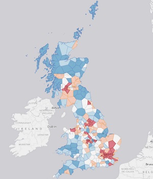
Above: Average car driving test pass rates across Great Britain. Cities such as Birmingham, Glasgow, Leeds and London (dark red) have the highest failure rates. Dark blue areas have the highest pass rates. This map should not be interpreted as a map of “easy” places to take your test; if you’re badly prepared then you’ll fail, no matter where you take it! Click here for the full map.
First, the legal niceties. In 2010, the UK government created a generic data licence called the Open Government Licence (OGL); anyone in the world is allowed to reuse data released under the OGL (e.g. make maps from it) without charge, as long as the original creator of the data is acknowledged. Many UK public sector bodies, such as the Department for Transport (of which the DSA is a part), release much of their data under the OGL. If in doubt, you should email the agency who produced the data you are interested in to get clarification. It’s always worth doing this because it’s incredibly frustrating to spend time producing a beautiful web map, only to realise you can’t actually publish it because you’ve breached copyright!
The first challenge was to get the location of each driving test centre as a pair of (X, Y) coordinates, i.e. geocode the test centre names. The Department for Transport (DfT) publishes a full list of test centres with addresses on their website; this data can be extracted, or scraped, from the web page using a custom script. I also found an online resource called ScraperWiki, where programmers and citizens with ideas can get together and collaborate to produce scraping software for difficult data sources. This particular screen-scraping script (try saying that quickly three times) was designed to pull out a list of driving test centres from the DfT website, so I had a usable list of test centre locations to work with, without having to write my own scraper.
The next step was to write a Python script to take the data in the PDF file, look up the postcode of each test centre in the scraped data, then use the free Code-Point Open dataset to convert the postcode into an easting/northing coordinate. The output was a CSV file with a row for each test centre containing its location and associated pass rate statistics. This wasn’t straightforward for two reasons: firstly, the names of the test centres are sometimes slightly different in the PDF compared to the scraped data (e.g. “Island of Mull” vs. “Isle of Mull”), so the Python code had to do a bit of guessing; secondly, some of the postcodes on the DfT website are invalid! In this case, I had to manually correct them.
Once I had the locations and statistics for each test centre, it was easy to import them into ArcGIS Desktop. I used the Create Thiessen Polygons tool to generate a catchment area polygon around each point, then clipped my polygons using Ordnance Survey’s free Boundary-Line dataset. Thiessen polygons mark out areas around each test centre containing locations closer to that test centre than any other test centre (in a straight-line sense). This assumes that people will travel in a straight line to their nearest test centre: not altogether realistic, but a straightforward piece of analysis that produces simple geometries.
Uploading my map to ArcGIS Online was also easy. The red-blue colour scheme was chosen to be friendly to certain users with Colour Vision Deficiency, a topic that my colleague Will White touched upon in a recent blog post.
Two final notes: first, if the idea of Python scripting makes you want to run away, don’t worry because it’s a gentle language to learn! The reality is that it’s still a frustrating experience working with most Open Data without scripting experience, although if you are an experienced spreadsheet user then you may be able to get around this. There are inevitably times when you will need to automate part of your workflow, so even a modest knowledge of Python (the scripting language of choice in GIS these days) can go a long way. This page links to several useful resources for Python beginners and Esri UK also runs introductory Python training courses delivered over the Internet.
Second, in my experience, at least 70% of your time building a web map will be spent collecting and processing data rather than designing a map. Of course, this doesn’t mean that the aesthetic elements of a web map aren’t important, and the balance of work can certainly tilt more towards design if your map has a complex layout and symbology. Still, it’s important not to underestimate the amount of time that data preparation takes. On the bright side, once you’re done massaging raw data into something usable, most of the pain is over. Have fun mapping!